A neutral room offers a calm, versatile foundation for your home, but without the right finishing touches, it can sometimes feel a bit too quiet or one-dimensional. This is where abstract art steps in to do some serious heavy lifting. Hanging the right piece in a neutral space can introduce texture, energy, and visual depth without disrupting the serene palette you’ve worked hard to create. Whether you lean toward bold splashes of color or subtle monochromatic compositions, abstract art gives you the freedom to shape the mood of a room while keeping the rest of your design choices flexible. The beauty lies in how you position and select these pieces to create balance, draw the eye, and transform a blank wall into a conversation starter.
Why Abstract Art Works So Well in Neutral Spaces
Neutral rooms are designed to be timeless and adaptable, but they need anchoring elements to prevent them from feeling flat or sterile. Abstract art brings in layers of interest through shape, color, and movement, creating a focal point that can shift the entire feel of the space. Because abstract pieces don’t rely on literal subject matter, they invite personal interpretation and can complement a wide range of furniture styles and decorative choices.
A monochromatic abstract painting, especially in black and white, can create a sophisticated and timeless gallery aesthetic that feels both modern and classic. These pieces work particularly well in neutral rooms because they echo the simplicity of the palette while adding graphic punch and visual structure. On the other hand, a bold, colorful abstract piece can serve as a striking focal point without overwhelming the space, precisely because the rest of the room provides a calming backdrop that lets the artwork shine.
The key is understanding that abstract art in a neutral room is not just decoration. It’s the personality of the space, the element that tells your story and sets the tone. Whether you want to energize a living room with vibrant brushstrokes or bring quiet elegance to a bedroom with soft, flowing forms, the neutral canvas gives you that flexibility.
Choosing the Right Piece for Your Room
Before you even think about hammering a nail into the wall, take a moment to consider the role you want the artwork to play. Are you looking to add warmth and energy, or do you prefer something calm and contemplative? The answer will guide everything from color choice to composition style.
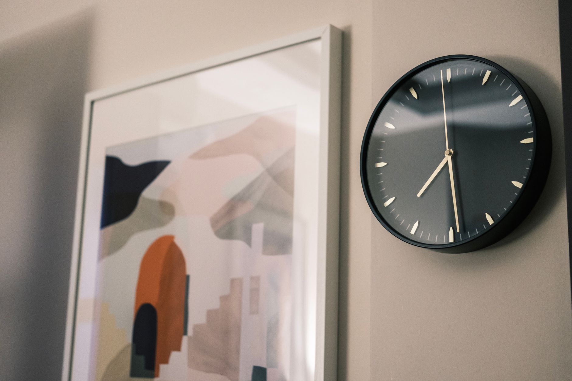
If your neutral room leans toward cool grays and whites, consider abstract pieces with warm tones like terracotta, ochre, or soft coral to introduce balance and prevent the space from feeling too clinical. Conversely, if your neutrals are warm beiges and creams, cooler blues, greens, or even charcoal can provide a refreshing contrast. The beauty of abstract art is that it doesn’t need to match your sofa or your throw pillows. It just needs to feel like it belongs in the emotional landscape of the room.
Scale matters just as much as color. A large-scale abstract piece can command attention and create a sense of drama, perfect for anchoring a living room or dining area. Smaller works, or a curated gallery wall of abstract pieces, can offer a more intimate, layered feel that works well in hallways, bedrooms, or cozy reading nooks. Think about the wall space you have and how you want the eye to travel across it. A single oversized piece makes a bold statement, while a collection of smaller works invites closer inspection and can tell a more complex visual story.
Next Level: When hanging abstract art above a sofa, leave a space of 6 to 12 inches between the top of the sofa and the bottom of the artwork. This creates a cohesive visual link between the furniture and the art, making the piece feel intentionally placed rather than just floating on the wall.
Placement and Positioning Techniques
Once you’ve chosen your piece, it’s time to get it on the wall in a way that feels natural and balanced. The general rule for hanging artwork is to center it at eye level, which typically falls around 57 to 60 inches from the floor to the center of the piece. This height ensures comfortable viewing and creates a harmonious relationship between the art and the rest of the room. Of course, if you have unusually high ceilings or specific architectural features, you might adjust slightly, but this range is a solid starting point for most homes.
When you’re working with a sofa or console table, the relationship between the furniture and the art becomes important. You want the artwork to feel like it’s part of the same conversation, not an afterthought. Maintaining that 6 to 12 inch gap between the furniture and the bottom of the frame helps tie the elements together visually. If you’re hanging a series of smaller abstract pieces, consider how they relate to one another in terms of spacing and alignment. A grid layout offers a clean, modern look, while a more organic, asymmetrical arrangement can feel relaxed and eclectic.
Lighting also plays a huge role in how abstract art is perceived. Natural light can bring out the texture and color variations in a painting, but direct sunlight can cause fading over time. If your artwork is in a bright spot, consider UV-protective glass or position it slightly off-center from the window. Adding picture lights or adjustable track lighting can highlight the piece in the evening and create a gallery-like ambiance that makes the art feel even more special.
Balancing Color and Texture
In a neutral room, abstract art has the unique opportunity to introduce color and texture in a way that feels both intentional and effortless. Even if your walls, floors, and furniture are all shades of beige, cream, or gray, the right piece of art can inject warmth, coolness, or vibrancy without requiring a full design overhaul.
Texture is especially important in abstract work. A painting with thick, impasto brushstrokes or layered mixed media adds physical dimension that catches the light and creates shadows, giving the piece a sculptural quality. This tactile element can be the difference between a room that feels complete and one that feels like it’s missing something. Even a minimalist abstract piece can introduce depth through subtle gradations of tone or the interplay of matte and glossy finishes.
When it comes to color, think about the emotional tone you want to set. Warm colors like reds, oranges, and yellows tend to energize a space and make it feel more inviting and social. Cooler colors like blues, greens, and purples can create a sense of calm and introspection. Neutral abstract art, using blacks, whites, and grays, can offer a sophisticated middle ground that feels modern and timeless. You don’t have to commit to one approach. Many abstract pieces successfully blend warm and cool tones, creating a dynamic interplay that keeps the eye engaged.
Q&A
What size abstract art should I hang in a small neutral room?
In a smaller room, one medium to large piece often works better than several small ones, which can make the space feel cluttered. A single statement piece draws the eye and creates a focal point, making the room feel more intentional and put-together. If you prefer multiple pieces, keep them grouped tightly in a gallery arrangement rather than scattered across the wall.
Can I mix abstract art with other styles in a neutral room?
Absolutely. Abstract art pairs beautifully with photography, portraits, and even traditional landscapes, especially in a neutral setting that offers a cohesive backdrop. The key is to maintain some visual consistency, whether through framing, color palette, or spacing, so the different styles feel like they’re part of the same curated collection rather than random additions.
How do I know if an abstract piece is too bold for my neutral room?
If the artwork makes you pause and feel something, that’s usually a good sign. A piece that feels too bold in the store often settles beautifully once it’s on your wall, especially in a neutral space that can handle the energy. Trust your instinct, and remember that you can always adjust the surrounding decor to support the piece if it feels overpowering at first.
Should I frame abstract art or hang it unframed?
This depends on the style of the piece and the vibe of your room. Canvas abstracts with painted edges often look great unframed for a contemporary, gallery feel. Works on paper or more delicate pieces benefit from framing, both for protection and to give them a finished, polished look. In a neutral room, a simple black, white, or natural wood frame tends to work best, letting the art itself take center stage.
Wrapping Up
Hanging abstract art in a neutral room is one of the most rewarding design moves you can make. It’s a chance to bring in texture, color, and personality without overhauling your entire space or committing to a rigid theme. The neutrality of the room becomes an asset, giving you the freedom to experiment with bold, expressive pieces or understated, contemplative works that shift the mood with subtlety and grace.
The real beauty of this approach is how personal it can be. Abstract art doesn’t tell you what to see or how to feel. It invites you to bring your own experience to the piece, which means every time you walk past that painting, you might notice something new or feel something different. In a neutral room, where the design is intentionally restrained, that kind of dynamic energy is exactly what turns a house into a home. Take your time choosing the right piece, pay attention to placement and lighting, and let the art do the work of making your space feel complete.